The hidden message in the famous Starbucks logo
With a calm smile, a beautiful face, long, symmetrically wavy hair, and her hands holding a mermaid’s tail, we talk about the most famous iconic logo today, which is the Starbucks coffee logo. What is the story of this logo and how did it develop from 1971 until today?
Most importantly, what is the secret that this mermaid’s face carries, and what message does Starbucks want to convey through the logo?
Starbucks logo history
First logo 1971 Complete quote For the legend of the mermaid
When the first Starbucks store opened in 1971, the logo represented a mermaid with two tails, which was taken from ancient sea books, while the image of the logo of a mermaid with an open body was taken from a wooden sculpture dating back to the sixteenth century.
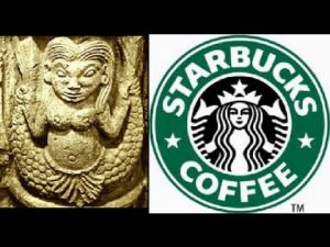
The first logo for Starbucks actually depicts a beautiful woman, which most likely reflects the company's desire to make people mesmerize and fall in love with Starbucks coffee when they buy it. Also, her being a mermaid was meant to remind of the original home of Starbucks, which is the American coastal city of Seattle.
Starbucks adopted the brown color for the logo at the time, which symbolizes the color of coffee beans. It also stimulates appetite and this color is associated with nature, nutrition, and stability.
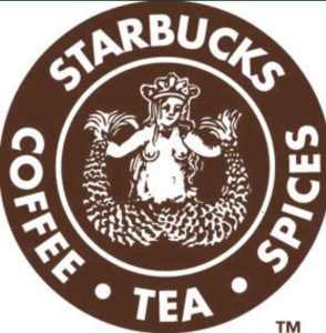
The second logo: 1987: The mermaid’s face is more beautiful and attractive
The Starbucks logo was modified for the first time in 1987 after the start of its career under its new owner, Howard Schultz. Then Starbucks moved towards withdrawing a little from the geographical context of the company, being in a coastal city, and wanted to present to its fans a more beautiful and attractive mermaid to attract more customers to its coffee, so this mermaid appeared on Starbucks cups with her well-known beautiful face and thick, wavy hair, with two perfectly symmetrical halves.
A star was also placed on the mermaid's crown and two stars on either side of the wordmark to link the logo to the name of the company, which contains the word Star in one of its sections. It is noteworthy that the name “Starbucks” was taken from the classic novel “Moby Dick,” which evokes the seafaring traditions of the early coffee merchants.
This is in addition to amending the word mark to include the company name and the word “Coffee” only, and also changing the color of the basic logo from brown to green, which indicates the enhanced growth and prosperity that Starbucks witnessed at that time.
The third logo, 1992, focuses on the mermaid’s face while keeping her tail
The logo became more modest as the mermaid's face was brought closer, making her features appear clearer, allowing a greater degree of human connection with the major brand through the eyes of the famous mermaid.
![]()
The edges of the two tails were also modified to resemble the sides of the crown, and the writing style was changed to be thinner and more modern. In general, it can be said that the Starbucks logo moved to become simpler, and the two halves were completely symmetrical.
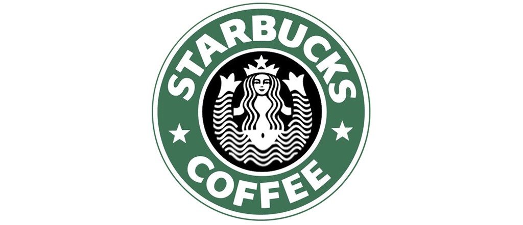
The current 2011 logo is simpler, more confident and modern
Starbucks said goodbye to the wordmark with stars next to the entire frame, as the famous brand became ingrained in the minds of its fans through this mermaid. Starbucks is confident in pronouncing its name immediately after seeing this logo, so there is no need to write it anymore.
After this modification, the Starbucks mermaid appeared confident and strong after she was given the opportunity to take the place of the word mark. Emphasis was placed on redesigning the mermaid’s face to be perfect and more harmonious while preserving the green color in the background.
![]()
The recent change to the Starbucks logo undoubtedly reflects the simple aesthetic touch with great impact, with the use of only two colors, green and white, and the focus on only one element, which is the famous Starbucks mermaid, which gave this logo an elegant, modern look with visual communication through the look of her eyes directly into your eyes. It reflects the company's interest in reaching the entire world through the most powerful human language, which is the language of the eyes. Here, Starbucks wanted to deliver a message to the world through the eyes of this mermaid, so what is it?
The hidden message in the famous Starbucks logo
Although the Starbucks logo appears to be completely symmetrical and perfect, it is not so, and this is what Starbucks intentionally wanted to do when making the last modification to the mermaid logo, which is the asymmetrical line on one side of the face, extending from the left side to the eyebrow and nose to make it appear larger than the shadow on the right. The nose is shaped to reflect the asymmetry of the two halves of the face.
There is a flaw in the mermaid's face that creates this asymmetrical shadow. The mermaid's straight forward orientation and the symmetry of all parts of the logo negate the possibility of inconsistent light or shadows on the mermaid's face, which confirms Starbucks' message that nothing can be completely perfect. There is no legend. Perfection No matter how perfect and harmonious things seem, you may need to examine and look deeply to discover the wisdom that there is and must be a flaw in everything.