Appearance Settings
Overview
Appearance Settings controls the visual theme, typography, and color scheme of your storefront. Customize how your store looks to create a unique brand experience for your customers.
Accessing Appearance Settings
Navigate to: Settings > Appearance from the sidebar menu
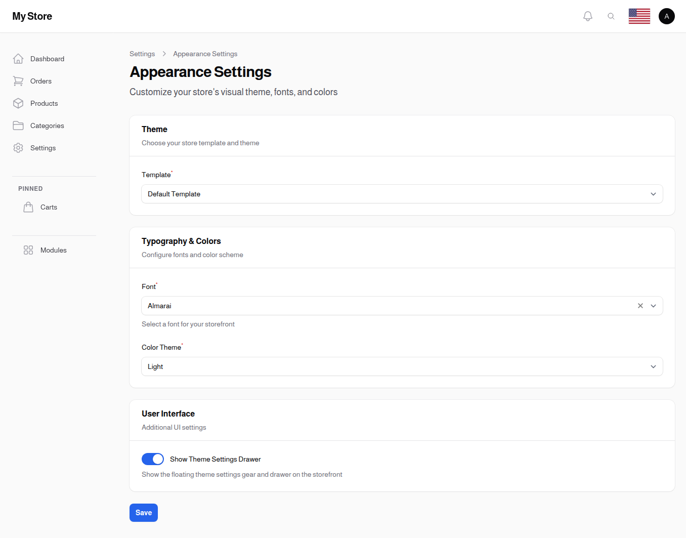
Theme
Template Required
- Type: Dropdown selection
- Default: Default Template
- Purpose: Choose the storefront theme/template
Options:
- Default Template: Standard storefront layout with pre-designed pages
- Dynamic Template: Customizable page builder template for full design control
Dynamic Template Feature:
When "Dynamic Template" is selected, a button appears: "Open Themes Manager (Remember to save your changes first)". This opens the page builder in a new tab where you can:
- Design custom page layouts
- Add and arrange content blocks
- Create unique landing pages
- Customize product listing layouts
Typography & Colors
Font
- Type: Dropdown selection (searchable)
- Default: Almarai
- Purpose: Set the typography for your entire storefront
Available Fonts:
The system includes a curated selection of web fonts optimized for both Latin and Arabic scripts:
- Arabic-friendly: Almarai, Cairo, Tajawal
- Modern Sans-serif: Poppins, Roboto, Inter, Montserrat
- Universal: Open Sans, Lato
Note: The selected font is loaded from Google Fonts or your theme's font library.
Color Theme Required
- Type: Dropdown selection
- Default: Light
- Purpose: Set the overall color scheme for the storefront
Options:
| Theme | Description |
|---|---|
| Light | Traditional light background with dark text |
| Dark | Dark background with light text (easier on eyes at night) |
| Auto | Automatically switches based on user's system preferences |
Note: This affects the entire storefront interface, not the admin panel.
Mobile Bottom Navigation
A sticky quick-access bar shown only on phones, fixed to the bottom of the screen. It gives shoppers one-tap access to the pages you choose. New stores start with Home, Wishlist, a center WhatsApp button, Cart and My Orders, and you can change any of them. The Cart and Wishlist buttons show a small count badge, and the page the shopper is currently on is highlighted.
Choosing the buttons
The buttons themselves are managed on their own screen: Marketing & Content → Mobile Bottom Navigation (/admin/mobile-bottom-nav-items). The toggle below only switches the whole bar on and off.
You can also edit the bar without leaving your store. Open your storefront, turn on live edit from the admin bar, and tap the gear on the bar itself. That opens the same editing in a window over the page, with a live preview of the bar as you build it, arrows to reorder the buttons, and the bar's own settings - including the WhatsApp number - at the bottom.
The bar only appears on phone-sized screens, so on a computer there is no gear to tap. Use Quick Links → Mobile Bottom Navigation in the admin bar instead; it opens the same window at any screen size.
For each button you set:
| Setting | What it does |
|---|---|
| Title | The word under the icon. Keep it short: long words are cut off on small phones. Use the language switcher at the top to fill it in for each of your store languages. |
| Icon | Picked from the icon library (Heroicons, FontAwesome, Bootstrap). |
| Opens | Either a page or link, or a WhatsApp chat. |
| Link | Where the button goes. Use the search icon next to the field to pick one of your own pages, a product, a category, a blog post or a brand, instead of typing an address. A full address to another website works too, and opens in a new tab. |
| Main button | Lifts this button into a raised circle above the bar. Only one button can be the main one - turning it on for another button turns it off here. |
| Circle Color, Icon Color, Text Color | All optional. Leaving them empty is usually best: the button then follows your store's colors and looks right in both the light and the dark view. A color you pick is used exactly as chosen in both. |
| Sort | The left-to-right order. You can also drag the rows in the table. |
| Visible | Hide a button without deleting it. |
Good to know:
- Up to six buttons can be shown at once. Hide one before adding a seventh.
- A button pointing at the cart disappears on its own when the cart is switched off in Cart Settings.
- The cart and wishlist count badges follow whichever button points at those pages, even if you rename it.
- If you hide every button, the bar disappears and pages use the full screen height, exactly as if the toggle below were off.
Enable Mobile Bottom Navigation
- Type: Toggle switch (On/Off)
- Default: On
- Purpose: Show or hide the sticky bottom bar on phones
When Enabled: Phone visitors see the bar at the bottom of every storefront page. It does not appear on desktop or tablet sizes.
When Disabled: The bar is hidden and pages use the full screen height.
WhatsApp Button
The bar's WhatsApp button is one of its buttons like any other: you show it, hide it, reorder it and recolor it in the bottom bar list. The only thing it takes from the WhatsApp Floating Button plugin is the number, so you never type that twice.
When a shopper taps it, a chat with your number opens in WhatsApp. A few seconds after the first page of a visit loads, a small "Need help? Chat with us" bubble pops up once over the button to draw attention.
Good to know:
- The button only appears when the WhatsApp Floating Button plugin is enabled and has a number. With no number there is nothing for it to open.
- The plugin's own floating button is separate, and has its own Show on Mobile switch which is off by default. Nothing links the two: if you turn that on while this bar also shows WhatsApp, phone visitors see two buttons.
- Hiding the WhatsApp button here hides it here, and nothing else changes.
User Interface
Show Theme Settings Drawer
- Type: Toggle switch (On/Off)
- Default: On (enabled)
- Purpose: Display a floating settings gear icon on the storefront
When Enabled:
- Customers see a gear icon (usually bottom-right corner)
- Clicking opens a drawer with theme customization options
- Customers can change colors, layout preferences, or theme mode
When Disabled:
- No floating gear icon
- Cleaner interface
- Customers use only the theme settings you've configured
Image Loading
Enable Image Placeholders
- Type: Toggle switch (On/Off)
- Default: Off (disabled)
- Purpose: Show a blurred low-quality preview while the full image is loading
When Enabled:
- Product images display a blurred placeholder instantly while the full-resolution image loads
- Improves perceived loading speed for customers
- Reduces layout shift as images load
When Disabled:
- Images appear only after they are fully loaded
- May result in blank spaces while images load
Design Tips
Choosing the Right Theme
- Light Theme: Best for stores with colorful product images, traditional e-commerce feel
- Dark Theme: Great for electronics, gaming, luxury products, or modern aesthetics
- Auto Theme: Provides flexibility for customers who prefer dark mode on their devices
Font Selection
- Arabic stores: Use Almarai, Cairo, or Tajawal for best Arabic text rendering
- International stores: Open Sans and Lato work well for both RTL and LTR languages
- Modern feel: Poppins, Inter, or Montserrat for a contemporary look
Theme Settings Drawer
Consider disabling the theme settings drawer if:
- You want a consistent brand experience across all customers
- Your design relies on specific color choices
- You find it clutters the interface
Saving Changes
Click the Save button at the bottom of the page to apply your changes. Changes take effect immediately on the storefront.
Related Sections
- Themes Manager - Advanced theme customization with page builder
- General Settings - Store name and logo
- Content Settings - Footer and branding content